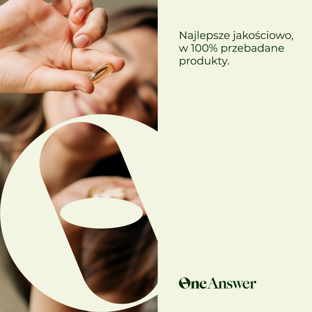
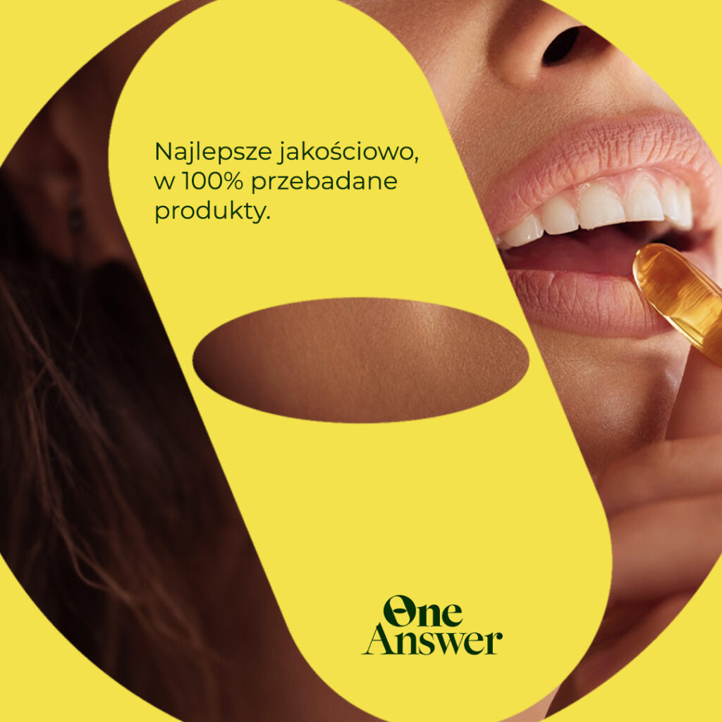
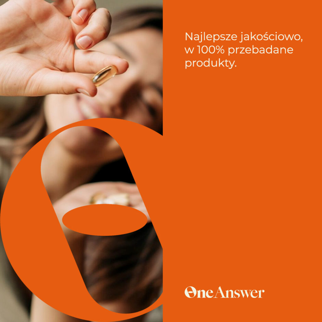
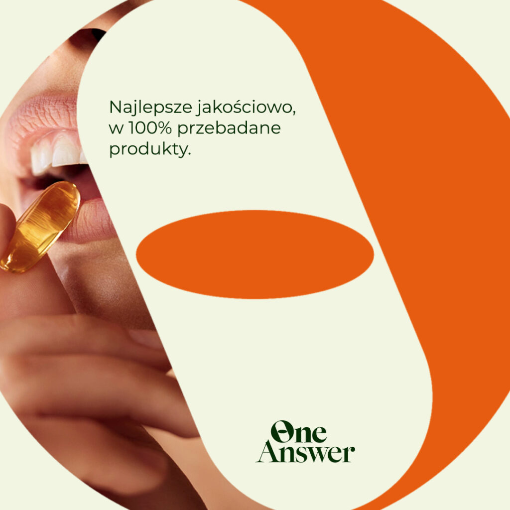
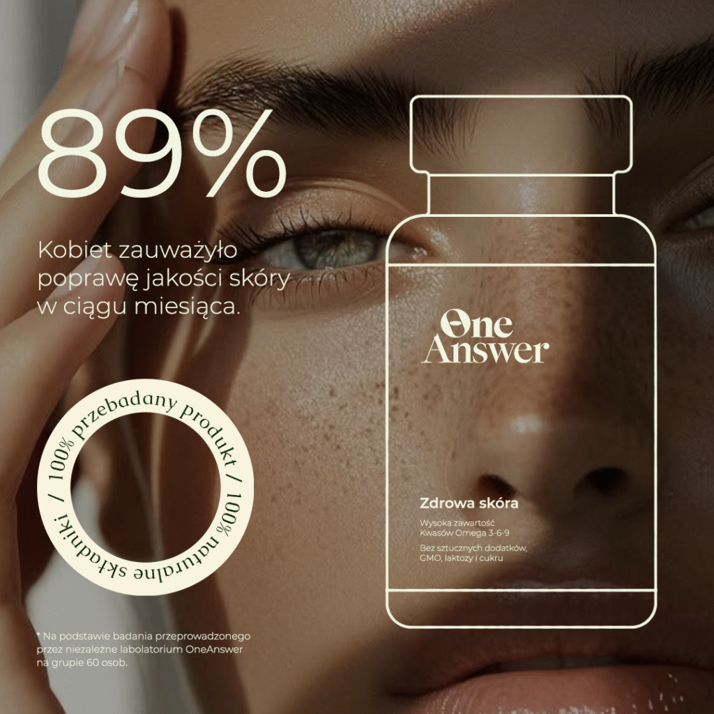
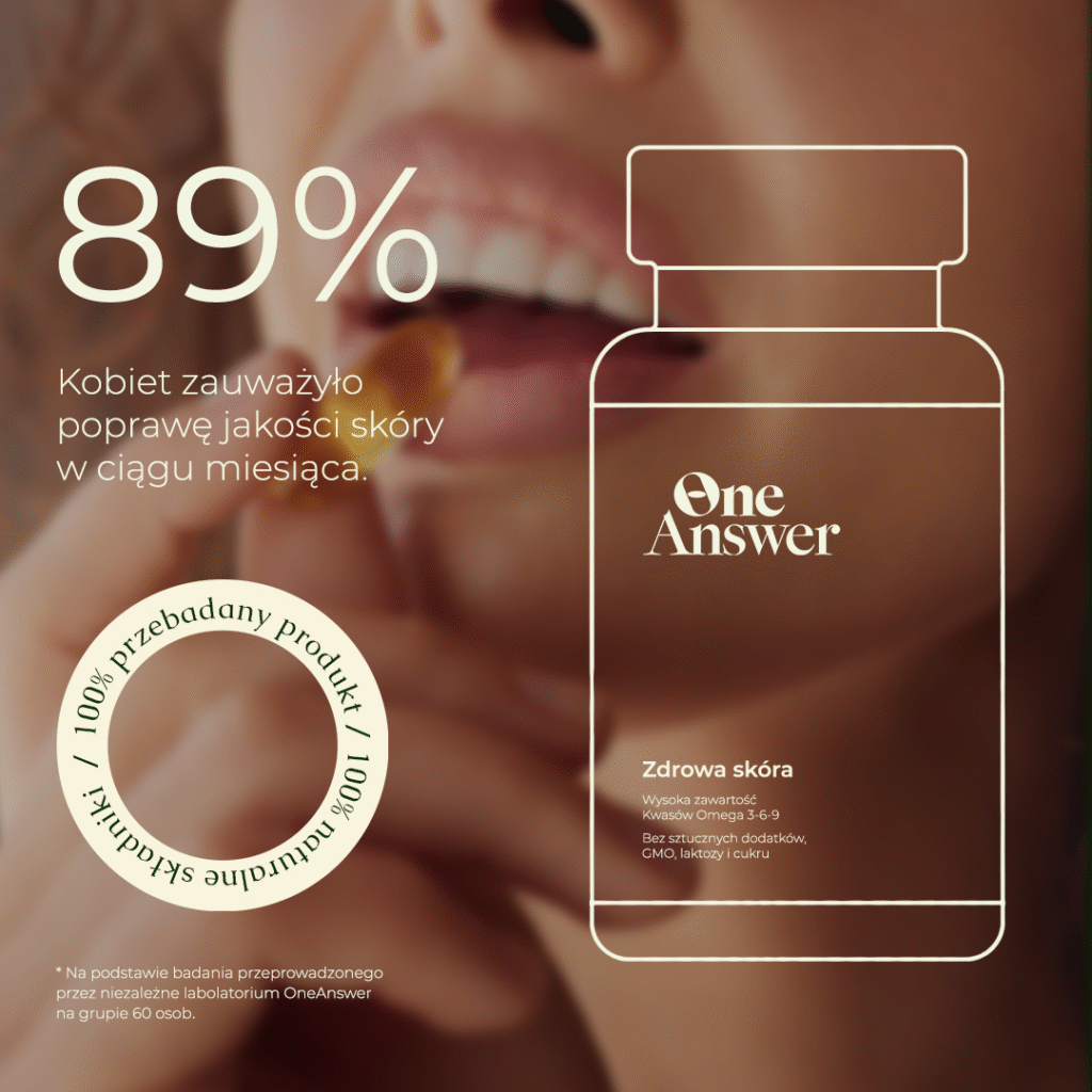
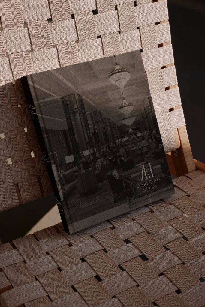
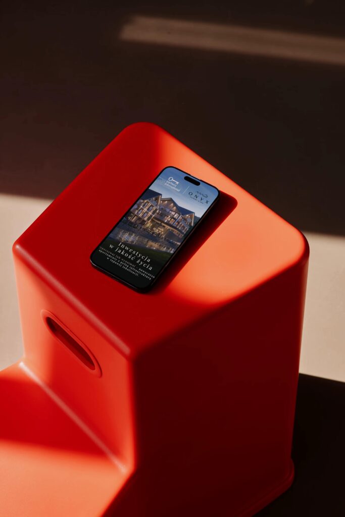
Every advertisement, whether published on the Internet or printed, i.e., leaflets or brochures, is most often overlooked if it does not contain elements that attract attention in the form of interesting graphic creations.
Graphic support {branding}

In our agency we make sure that your company has never been overlooked and effectively written in the memory of your potential customers. We create various types of graphic formats, ranging from creations used on the Internet, in social media, in publishing portals, through folders, flyers, stands, to billboards or magazines. Each graphic is individually tailored to the needs of your company, so you can be sure that the advertising message will attract the attention of your customers and remain in their memory for a long time.

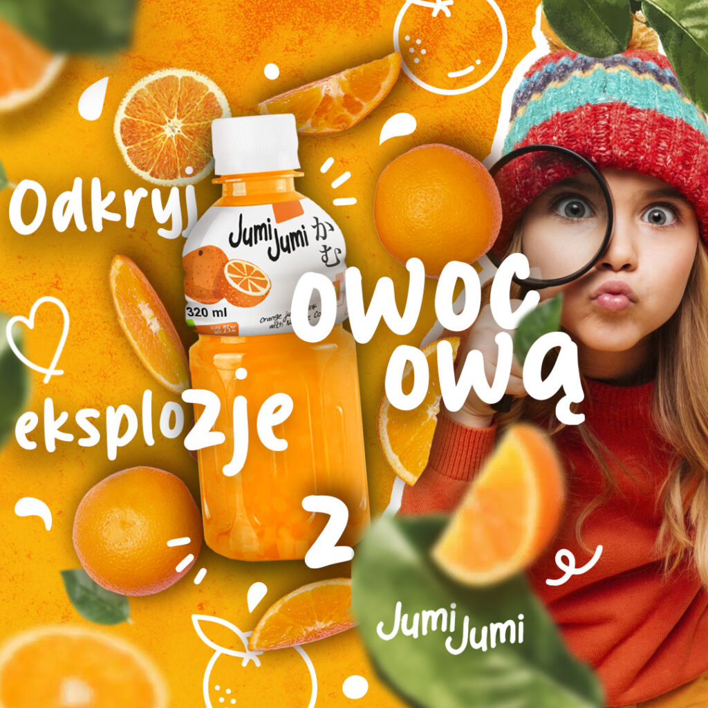
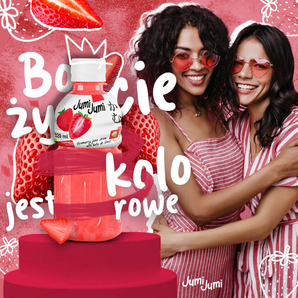
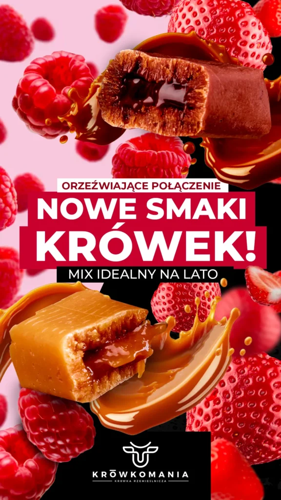

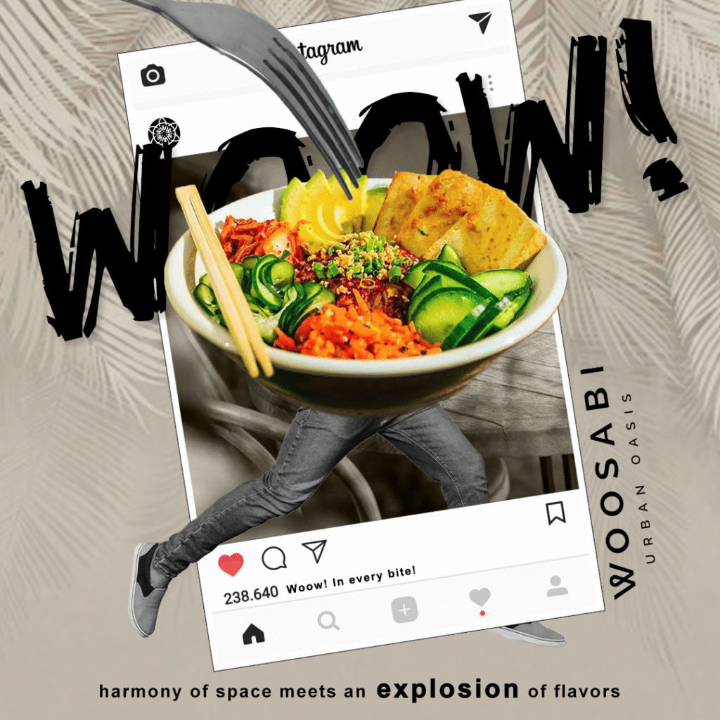

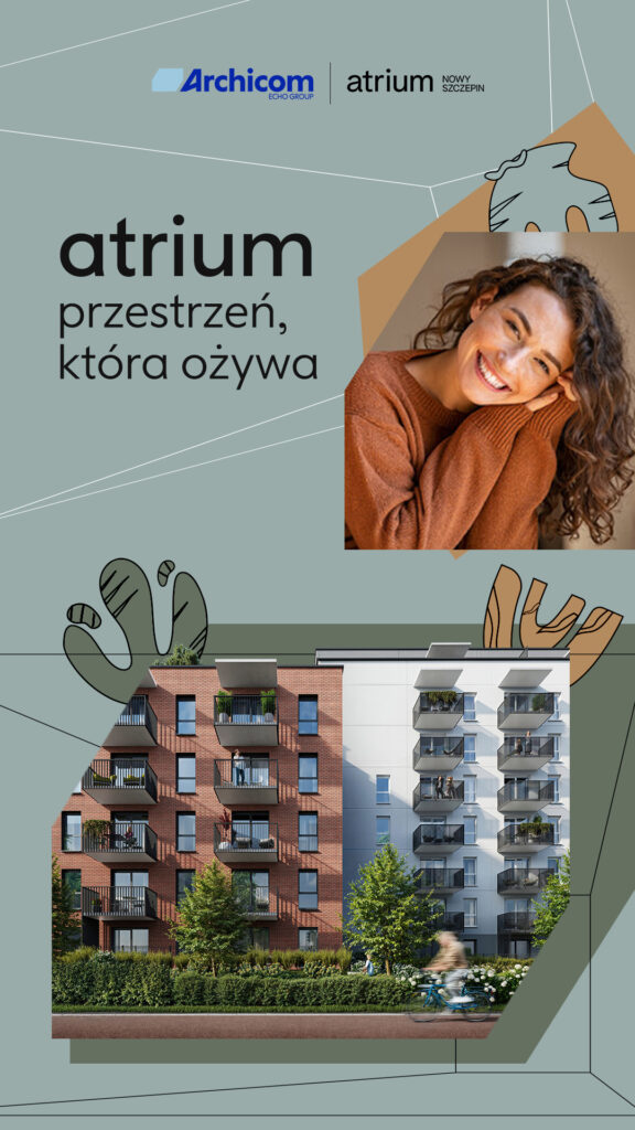
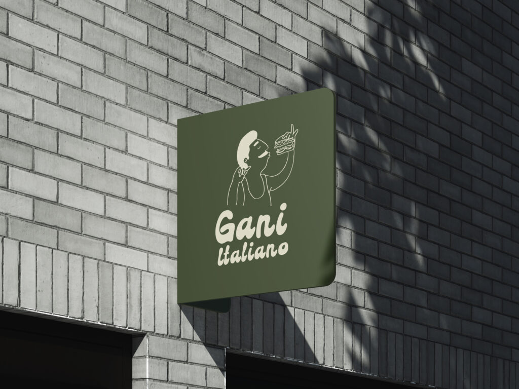
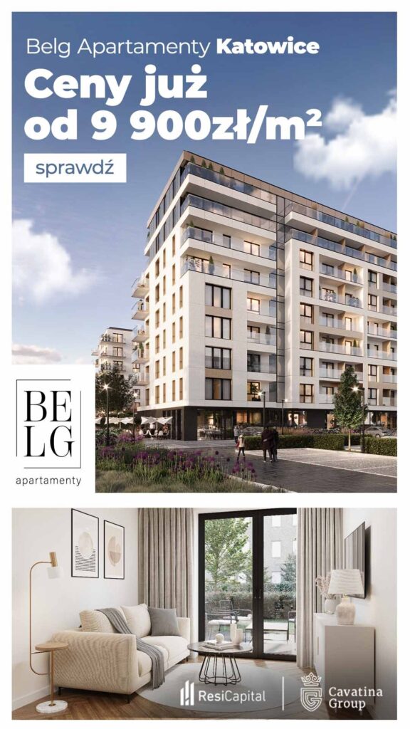
Keep it simple: Let’s stick to the rule: The less, the better. Let’s not be aggressive, flashy, trying to dazzle with colour, overloading banners with a million elements; that’s of no interest to our recipient, instead it will scare them off. Websites have a lot of content, and the ’environment’ of our banner is already enough of a hotch-potch/kogel mogel. Let’s stir up emotion, but only positive emotion. Let’s keep the right proportions and spaces, and keep texts simple. A simple message is the one that’s clearest and defines the basic purpose of your banner, ensures visual consistency and makes the potential customer take action. Simple designs clearly communicate what they are about, and we have limited time to act. It’s only a few seconds. Let’s not make our task harder.
Make it consistent: A beautiful banner is not at all the key to success if it is not consistent with the website. The banner and the website should be consistent, otherwise chances are high that the viewer will leave the website. So, remember: put the company logo on the banner, be consistent with the use colours and font from our brandbook, and don’t deviate too far from the style of graphics used on the website.
Let them be a call to action: Our goal is to generate clicks and/or encourage engagement. Let’s prompt our recipient to a clear call to action. Call To Action – let’s lead the recipient by the hand, let the colour make our button on the banner stand out, let it contrast with the rest of the banner, and let the message be ‘order’, ‘buy now’ or ‘check out’ — draw their attention and encourage them to click.
In short:
– Arouse emotions, but only positive ones!
– Include specific and interesting content.
– Keep the visual coherence with the WWW. Let’s call for action!


